
GE Power Generation Case STUDY
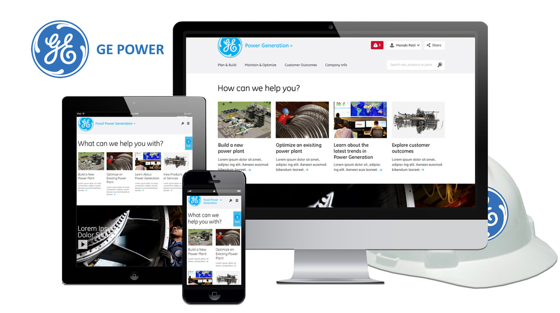
GE Power Generation made the decision to separate Wind, Hyrdo and their Hybrid (Wind, Solar and Electric) to its own division called GE Renewable Energy. This site represents the groundwork for navigation and content organization, for both the newly formed GE Power Generation and the future divisions of GE Power & Water and GE Renewable Energy.
BUSINESS CHALLENGES
TARGET AUDIENCE
Product Engineers, Mechanical Engineers, and Site Maintenance Personnel using the GE Renewable Energy site to design power systems in countries around the world.
PROJECT OBJECTIVES
DELIVERABLES
- Cumbersome and glitchy navigation; required too many clicks to reach the desired site areas.
- Educational and Informational content, like part specifications and maintenance, was disorganized and difficult to find.
- Previous site lacked responsive scalability.
- Previous site did not support multi-lingual usage.
- Previous designs failed to meet accessibility standards.
TARGET AUDIENCE
Product Engineers, Mechanical Engineers, and Site Maintenance Personnel using the GE Renewable Energy site to design power systems in countries around the world.
PROJECT OBJECTIVES
- Design the GE Power Generation site with an Engineers-first protocol toward organizing content.
- Create simplistic channels that funnel users to the Education, Information, and Operation of GE machinery and technology.
- Streamline navigation and create a Member Portal to allow users to save search and profile preferences and house frequently viewed content.
- Design a site consistent with GE brand standards, including a reusable library of W3C-compliant visual assets.
- Translate site into 97 languages for worldwide accessibility.
- Create a library of value-added content featuring projects, tools, and tips.
DELIVERABLES
- Conduct a deep dive customer experience audit with Engineers and Stakeholders.
- Create a consistent and reusable design language.
- Assure site meets all w3C standards for web accessibility.
- Create a SSO portal for engineers and maintenance staff to store frequently viewed content
- Redesign educational and informational content into intuitive searchable libraries
THE PROCESS
The GE Power Generation Project presented a unique set of logistical challenges. Due to the size and complexity and the international presence of the site, 12 project teams were established in the US, Europe, Asia, and South America; with the US and European divisions leading design and implementation efforts. The Sprints below represent the Chicago and San Francisco teams project process over a 12-month time period.
SPRINT 1
Weeks 1-8 UX: Research. Understand and observe. Conduct 125 user interviews in the US and European markets with Engineers, Maintenance Personnel, Educators, Sales Teams, Product Owners, Stakeholders. Write and distribute 5 product-specific surveys (Wind, Hyrdo, Hybrid, Fossil, and Nuclear) to 500 internal and External GE participants.
Week 9-14 UX: Ideate. Synthesize data collected and create primary user personas, problem statements, hypothesis statement. Design IA, create user flows, identify main entry points for web, tablet and mobile.
Week 15-19: UX Prototype. Build a physical and interactive system for web and responsive iOS with rapid sketching and wireframing. Build out main features and dynamically represent user flow to a depth of 3 clicks on all expandable menus in hi-fidelity prototypes.
SPRINT 2
Week 20-24: Iterate: Create test plan. Document direct user tasks through user journey. Create team to test features and user flows. Summarize findings in usability test report. Document changes and update wireframes.
Week 25-26: UI: Implementation of UI and copy for iOS, Android, and Web. Check in with Stakeholders, Product Owner, and Dev Team for approval.
Week 27-31: UX/UI Evaluate: Conduct second user testing with UI comps, Iterate UI comps if needed, Seek DoD from Stakeholders and Product Owner.
SPRINT 3
Week 32-48: Development: Website and app development. Provide comps and assets to the dev team, including CSS Style Guide and Hi-Fidelity Prototype.
A/B test in QA before launch. 1 month, iterate if needed after testing complete.
RESEARCH METHODS
Google Surveys, User Interviews, an Unmoderated Remote Panel and UX Studies.
THE OUTCOME
The streamlined navigation and a thoughtful reorganization of content improved usability for the target audience. Customer Service calls related to product part numbers, instructional pdfs and case studies reduced by 44% in the first month of the site re-launch. Post launch surveys distributed to the same group of 500 participants reported a 68% user satisfaction rating in the transparency of essential tools and documentation. In the first 3 months of the site launch, more than 14,000 users worldwide registered a unique username and password to access the benefits of the Member Portal.
